Free All-in-One Office Suite with PDF Editor
Edit Word, Excel, and PPT for FREE.
Read, edit, and convert PDFs with the powerful PDF toolkit.
Microsoft-like interface, easy to use.
Windows • MacOS • Linux • iOS • Android

How to add data labels in excel to graph or chart (Step-by-Step)
Data labels are used to display source data in a chart directly. They normally come from the source data but they can include other values as well. Generally, the easiest way to show data labels is to use the charts element menu. When you check the box, you see data labels appear in the data. This process is little bit tricky but just stay with us and sit tight.
How to add or remove data labels in a chart onlin, 2016 and 2019
You may add data labels to the data points in a chart to quickly identify a data series. The data labels are connected to values on the worksheet by default, and they update automatically as these values change. Because they offer specifics about a data series or individual data points, data labels make a chart easier to comprehend. Without the data labels, it would be impossible to determine that coffee accounted for 38% of total sales in the pie chart below. You may add labels to one series, all series (the entire chart), or one data point, depending on what you wish to highlight on the chart.
Add data labels to a chart
1. Select a data series or a graph. After picking the series, click the data point you want to label.
2. Click Add Chart Element Chart Elements button > Data Labels in the upper right corner, close to the chart.

3. Click the arrow and select an option to modify the location.
4. Click Data Callout if you want to present your data label inside a text bubble form.

You may move data labels inside the data points or even outside the chart to make them easier to read. To relocate a data label, simply drag it to the desired spot.
If the labels appear to be excessively cluttered on your chart, you may delete any or all of them by selecting the data labels and then pressing Delete.
How to change the look of data labels
1. To display extra data for a data series or data label, right-click it and select Format Data Labels.
2. Select the items you want under Label Contains by clicking Label Options.

How to use cell values as data labels in excel
1. To display extra data for a data series or data label, right-click it and select Format Data Labels.
2. Select the Values From Cells checked under Label Contains under Label Options.
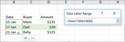
3. Return to the spreadsheet and pick the range for which you want the cell values to show as data labels when the Data Label Range dialogue box displays. The selected range will display in the Data Label Range dialogue box once you've done so. Then press OK.

The cell values will now display as data labels in your chart.
Note: This tutorial was an attempt to help you understand how to add data labels in excel on Windows, Online and Mac.
You just need to have a little understanding of how and which way things work and you are good to go. With having this basic knowledge or information of how to use it, you can also access and use different other options on excel or spreadsheet. Also, it is very similar to Word or Document. So, in a way, if you learn one thing, like Excel, you can automatically learn how to use Word as well because both of them are very similar in so many ways. If you want to know more about WPS Office, you can download WPS Office to access, Word, Excel, PowerPoint for free.
Also Read:
- 1. 10 Gorgeous Excel Graph Templates for Data Analysis and Visualization
- 2. How to insert a line chart in a column chart?
- 3. How to add trendline in excel line graph
- 4. 10 Excel Graph Paper Templates to Make Data Visualization Easy
- 5. How to add a maximum value in excel graph
- 6. How to add vertical line to excel chart in excel graph
