Free All-in-One Office Suite with PDF Editor
Edit Word, Excel, and PPT for FREE.
Read, edit, and convert PDFs with the powerful PDF toolkit.
Microsoft-like interface, easy to use.
Windows • MacOS • Linux • iOS • Android

How to create an impressive dashboard in WPS Office Excel
Welcome to WPS Official Academy! After reading this free tutorial, you will be able to master how to create an impressive excel dashboard in WPS Office.
 ;
;
lWhat is a dashboard in Excel?
A dashboard is a visual presentation of key metrics, which is usually composed of various elements including charts, gauges, tables, and figures. It simplifies the complex data and presents the current status at a glance, helping you make decisions easily and quickly. Dashboards are widely used in work reports, for example, KPI report, revenue report, financial report and the like.
lSteps to create a dashboard in WPS Spreadsheet.
o Prepare the appropriate dataset and brainstorm the purpose of the dashboard
Take this worksheet as an example. The worksheet records the export status of a coffee brand, in which the data of date, customer name, salesperson, country, price, quantity and revenue is available.
And assume that we need to analyze:
1. Total revenue per month
2. Total sales in different countries
3. Total sales by different employees
o Use various tools to process and present the data.
Before creating the dashboard, we need to process the dataand prepare the elements in advance. Please follow the steps below:
1. Total revenue per month
In the worksheet, the total revenue is given in the Revenue column, which is calculated from the formula =price*quantity-cost. And the date is given in the Date column. In order to analyze the total revenue per month, we can create a pivot table to sum up the data.
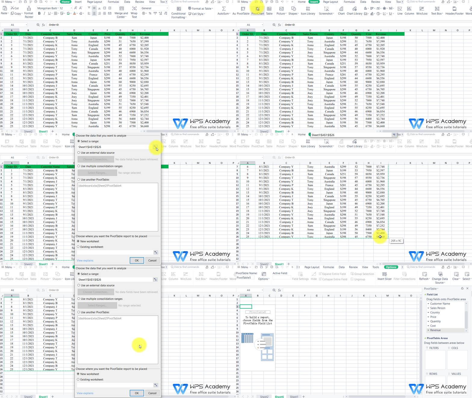
① Open the file in WPS Spreadsheet, and go to the Insert tab. Click the PivotTable button in the upper left corner. In the pop-up dialog, select the range of the data that you want to analyze and choose the place to put the pivot table.

② Then, a new sheet with the PivotTable pane on the right will be opened. Drag Dates into the Rows section and Revenue to the Values section.
③ Now we can use the pivot table to create a line plot. Select the pivot table and go to the Insert tab. Click the Chart button and choose a style you like under the Line option.
Then, we have successfully create a visualization; now we can use it to analyze the change tendency of revenue per month.
2. Total sales in different Countries
In the worksheet, the total sales in different countries are not given, and thus we calculate with the formula =price*quantity in the column J.
① Select the whole table and navigate to the Insert tab, and click PivotTable to create a pivot table as well. Drag Country into the Rows section and Sales to the Values section.
② Then, we can create an area chart to visualize the distribution of sales in different countries. Select the pivot table, go to the Insert tab and click on Chart. Then choose a style under the Area option.
Now, we can see that the coffee brand sells best in Australia and Singapore, while its performance in France is not ideal.
3. Total sales by different employees
The total sales by different emplolyees are already given in the Sales Person column.
① We can also create a pivot table first following the above steps.
(Note that drag Date to Rows area, Sales Person to Columns area and Sales to Values area.)
② To analyze the performance of each employee, we can create a radar chart. Select the pivot table, go to the Insert tab and click Radar to insert a radar style as needed.
o Design the layout of your dashboard
1. Create a new sheet and go to the Page Layout tab. Click the Align drop-down button and deselect Show Grid.
2. Copy the charts from the pivot sheets and paste in the new sheet. The adjust the layout as you wish.
3. Select one chart and head to the Insert tab. Click on Slicer and check the items related to the other two charts in the pop-up dialog.
4. Right-click on each slicer and click Report Connections. And check all charts to link them.
Well done! Now let's preview the result.
If you want to learn more operations about pivot table in Excel, please visit WPS Academy for more free tutorials.
Learn pivot table from the beginning | WPS Academy Free Office Courses
How to set the calculated field of the pivot table | WPS Academy Free Office Courses
WPS Office Spreadsheet is helpful for various fields of studies: mathematics, statistics, data science, engineering, finance, and such. Rich functions paired with teaching procedures, WPS Office Spreadsheet definitely is a professional and reliable toolkit.
Also Read:
- 1. 10 free excel dashboard templates
- 2. Best 10 excel dashboard examples in free excel 2022
- 3. WPS Top 10 Marketing dashboard Excel Templates
- 4. WPS Top 10 Cash flow dashboard Excel Templates
- 5. Top 10 Financial Dashboard Excel Templates That Are Perfect
- 6. Top 10 free dashboard templates Excel download 2022
